Lantern Stock Analytics App
Client: Lantern is a Stock Analytics app that uses AI to provide investors and traders access to real time data and personalized insights for the stock market. As a startup, Lantern works on a lot of new features as well as optimizing their existing design.
Problem: Lantern’s mission is to give traders insights, but it lacks a trade execution feature. This makes the users have to switch from Lantern to other various trading apps to be able to execute orders, which drives down user engagement on the Lantern App.
My Role: I worked on all the design stages from research to high fidelity mockups of the brokerage integration and trade execution features.
Team: Me, 1 UX Designer, 2 Developers (Co-Founders)
Duration: 1 month
-
"How might we help users effectively link/unlink their brokerage accounts and then execute trades based on their preferred brokerage on stocks, options and equities?"
REVIEW OF EXISTING RESEARCH & DESIGNS
Reviewed all the existing designs and app to learn more about the product's background. We also went through the previous research and design work to pick up from where it’s left. The documents consisted of Personas, User Interviews and synthesis of the user interviews, which then informed our design decisions.
Insights from previous researches:
Users like the simplicity of the interface but are eager for the app to become more functional.
Users already access information from variety of sources.
Users embrace Lantern as a tool that can truly help them make better-informed decisions about how to trade options.
Users like being able to switch to dark mode.
As a Persona, Chris is a financial planner that has a few years of experience in the stock market that wants to learn options trading.
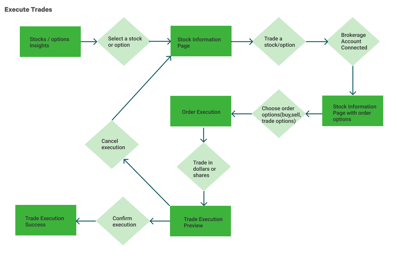
Users want to place an order in a single go to cut down trading time.
Competitive Research
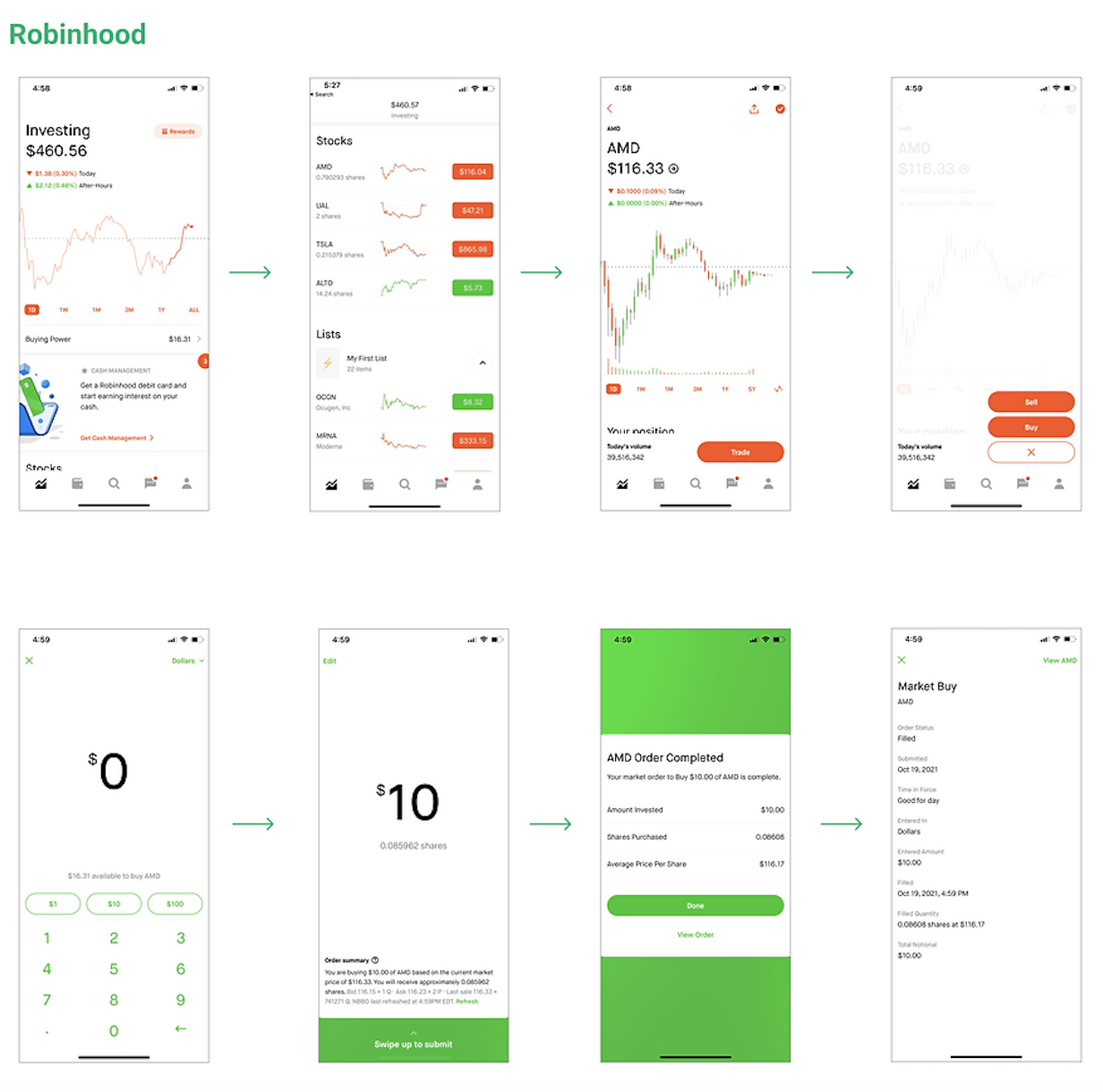
After going through the research Lantern already had, we decided to go with Competitive Heuristic Research to analyze the existing similar products in the market. The 6 products we analyzed includes Robinhood, Commonstock, Fidelity, E-trade, Tastyworks and Atom FInance. We focused our analysis on the features
Link/Unlink Brokerage Account
Trade Execution
Analysis of competitors provided clarification for the flows and design decisions for Lantern.
USER FLOWS
Lo-Fi Wireframes
According to the analysis of competitors and constant feedback from the stakeholders of Lantern we designed wireframes to be able to map out layouts. These layouts speed up the design process before diving deep into visual side of things.
1st Round of Usability Tests
After putting out the wireframes, we created a prototype to present it to stakeholders. Discovering the problems and concerns before diving into high fidelities was crucial and played an important role in sticking to the time constraint.
Here are the major issues that helped us iterate accordingly:
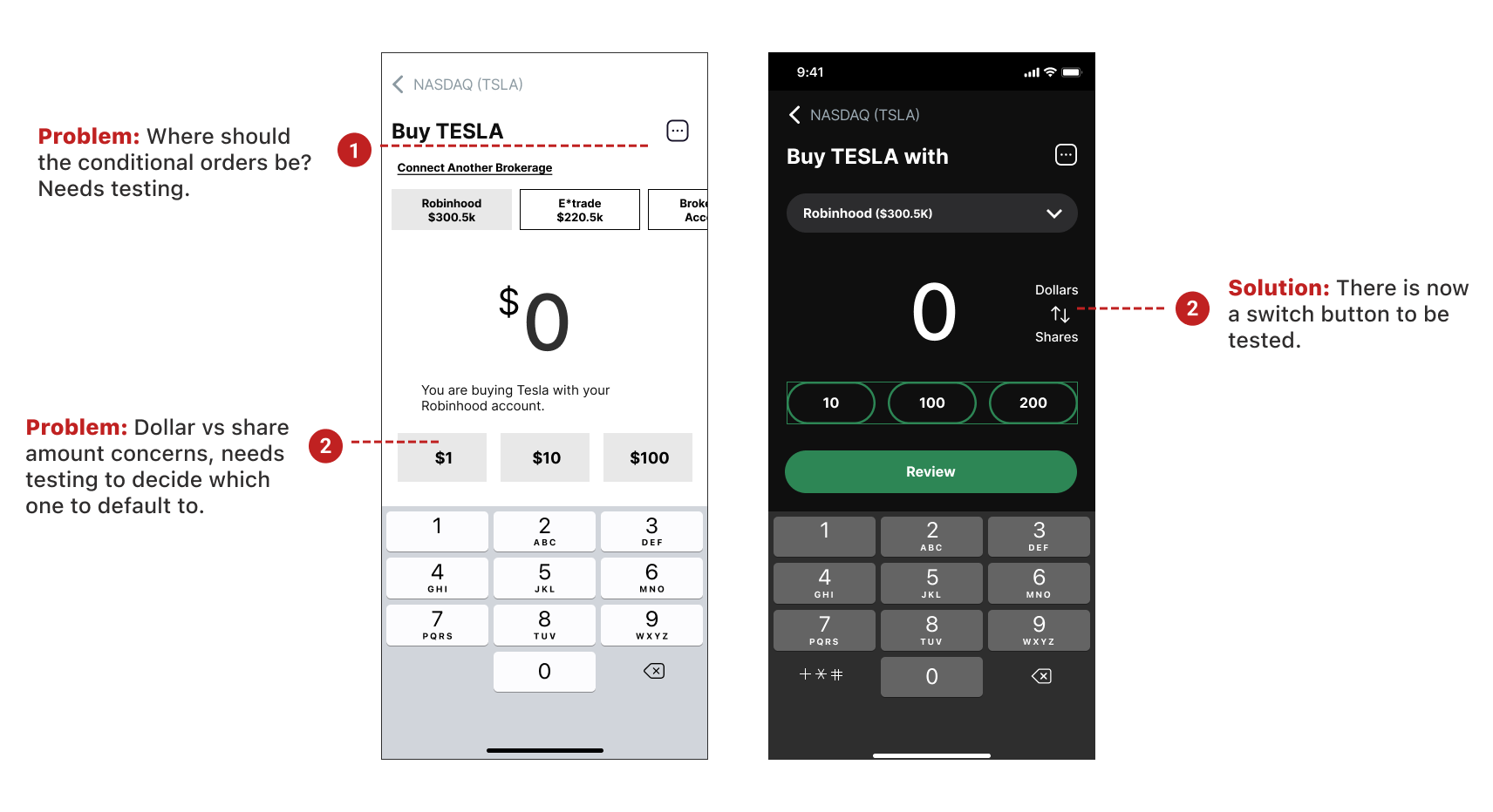
Number of shares vs dollar amount on order placement
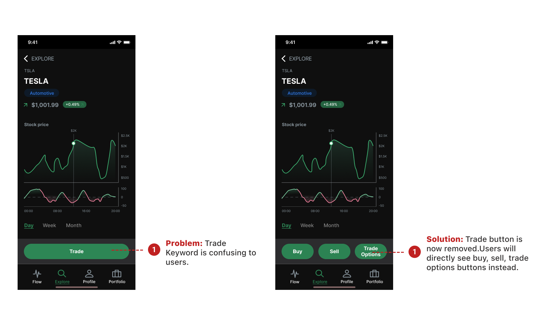
Buy, sell, trade options buttons spacing and placement of these buttons.
Navigation bar
Content of portfolio and design of switching between brokerage accounts
Information architecture of conditional orders
Details of executed order
FIRST ROUND OF USABILITY TESTS
HIGH FIDELITY MOCKUPS
1st Iteration of High Fidelities
After analyzing the findings and coming up with solutions, we came up with high fidelity mockups. Integrating the visual design into our ideas took substantial amount of time because we wanted to make sure our designs were consistent with previous designs. We had to constantly communicate our design decisions with stakeholders to get their approvals.
Why did we start with dark mode: Since dark mode is the current default mode of Lantern and also one of the UI Design trends, we started with dark mode designs.
Accessibility Issues Found
Once we started working on the UI, we discovered the accessibility issues of previous designs. After getting the approval from the stakeholders, we worked on optimizing the colors with the goal of making them compliant with WCAG AA guidelines.
2ND ROUND OF USABILITY TESTS
We recruited 5 participants for our moderated usability tests.
Why specific users were picked: We looked for users that have knowledge of the stock market and experience in placing conditional orders. Despite being hard, finding knowledgeable users were very important for our tests due to the complexity of the stock market.
Why moderated usability tests: Moderated usability tests allows for the highest level of interaction with the user. Even though we had time constraints we knew we needed to moderate the usability tests to get the best value out of it.
We tested the following tasks within our scope:
Trade execution with dollars/shares
Connect brokerage accounts
Switch between brokerage accounts while putting an order
Execute a conditional order
-
Dollar amount is preferred by the majority when executing an order.
-
Default amounts are helpful when executing an order.
-
Trade keyword is confusing to participants.
SECOND ROUND OF USABILITY TESTS
HIGH FIDELITY MOCKUPS AND PROTOTYPE
After receiving and integrating plenty of valuable feedback, we worked on 2nd iteration of high fidelities. These high fidelity mockups were turned into a prototype on Figma to showcase the changes to the stakeholders.
More validation needed: Due to time constraints, we could not run another round of usability tests to validate our solutions. However, we made sure to inform the stakeholders.
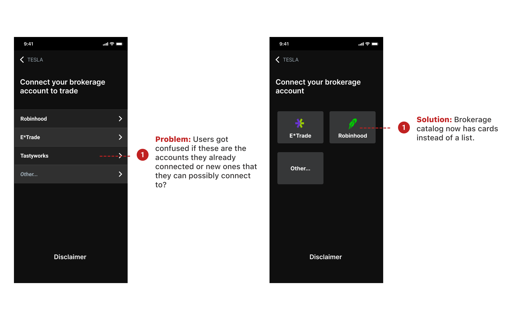
Connect your brokerage account
Users have the option to choose the brokerage account to be able to execute trades. This feature helps users stay on the app without having to switch to other apps to apply the insights they learned.
Trade execution with your preferred brokerage account
Now, this screen allows users to do stock exchange with their preferred account. They can see how much money they have in different accounts. In addition, the default amounts are in dollar amount but users can directly switch to share amount if they prefer.
Explore stocks
Explore page now has following section to help users easily see the stocks they are interested in. Carrying the following section helped make the navigation bar less crowded.
SUMMARY
CHALLENGES TAUGHT ME A LOT
It was challenging to apply accessibility guidelines on the new features due to the existing design’s color contrast issues. We had to spend substantial amount of time to do research on dark mode and make the color contrast work for it.
If we had more time: I would do second round of testing with high fidelities to validate our design solutions. I would also discover more on how to optimize dark mode designs as well as deliver light mode screen designs.
Proved how efficient usability tests are: The founders and engineers of Lantern were very happy with the insights and feedback that came from usability tests, they mentioned that they want to invest more into usability testing from now on.
What’s next: After presenting the deliverables to stakeholders, we hand-off everything to the developers. The next step is for these designs to go live.
